
|
|
 07/02/2010, 09:10 PM
|
#51 |
|
Registered Member
 |
still needs a lot of tweaking!
the acrylic isn't blurry enough once it's lit from behind. Getting 400 and 800 grit on Tuesday. Hopefully one of them will be just right. Tried 320 grit before and it was too harsh. needs to soften the edges of the cuts outs (thinking of using the same paint I used as background and just put a light layer over the edges It also seems too crammed now. Thinking of dropping the rock on the left or signicantly shortening it. But here's what it looks today: 
__________________
Karin Current Tank Info: 215g Caribbean Inspired Reef with Shadowbox |

|

|
|
07/02/2010, 11:00 PM
|
#52 |
|
Registered Member
Join Date: Dec 2007
Location: Central California Coast.
Posts: 5,383
|
I concur with, 'drop the left one'. Good art is asymmetric anyway.
Can you get the light more in front? That would lessen the contrast difference. It's coming together though! |
|
|
|
|
07/02/2010, 11:01 PM
|
#53 |
|
Registered Member
Join Date: Apr 2004
Location: Baton Rouge, LA
Posts: 1,398
|
Looks good, and I would agree, it seems like it needs to be blurred out a little bit more. You're definitely on the right track though.
__________________
"I look for absolutes and there are absolutely none." 311 |
|
|
|
|
07/03/2010, 12:19 AM
|
#54 |
|
Registered Member
Join Date: Apr 2010
Posts: 198
|
great idea! cant wait to see what happens here
__________________
Jesse 72g Bow,sps, 6 bulb TEK light, RKE, 2 part, 2x mp40w es |
|
|
|
|
07/03/2010, 08:03 AM
|
#55 |
|
Registered Member
Join Date: Oct 2006
Location: Barrie, Ontario, Canada
Posts: 6,639
|
it looks too well lit....no way to dim the light eh?
i also agree with you...little cramped in there now...depending on how you plan on placing your live rock...i would remove the left one entirely, and separate the other one into two parts and place the other about a 1/3 of the way over...but i certainly dont want you to take it appart only to hate it afterward...gonna take some visualization to get her perfect the way you want it.. maybe like this? sorry it is a crappy MSpaint rendition 
Last edited by NanoReefWanabe; 07/03/2010 at 08:20 AM. |
|
|
|
|
07/03/2010, 09:07 AM
|
#56 |
|
Registered Member
|
Ha I love to plan like that too.
I actually cut them apart when you were painting this  (added virtual overflow boxes since I didn't consider them in my original cut out design hence my scene got so wide even though 1/3 was never going to be visible I am going to make Marcos style rock covers for the overflow boxes and place my nylon rod-ed rock structures in front of that. similar to this. might move left mountain toward center a bit.  Lighting is actually not as bright as it appears in the pictures. It's the main light source in the room so the camera really picks up on the light
__________________
Karin Current Tank Info: 215g Caribbean Inspired Reef with Shadowbox |
|
|
|
|
07/03/2010, 08:23 PM
|
#57 |
|
Registered Member
Join Date: Oct 2006
Location: Barrie, Ontario, Canada
Posts: 6,639
|
ahhhh....boo to the overflow boxes...no way around though i guess now...still looks smokin good though...
|
|
|
|
|
07/06/2010, 06:27 PM
|
#58 |
|
Registered Member
|
okay the 800 grit worked great. I think the blurriness is really good now.
I twisted the reflector slightly to have the sun more towards the right. Can you tell?  
__________________
Karin Current Tank Info: 215g Caribbean Inspired Reef with Shadowbox |
|
|
|
|
07/06/2010, 06:44 PM
|
#59 |
|
MrRyanT
Join Date: Nov 2006
Location: Memphis, TN
Posts: 1,731
|
Wow! Been following along and I have to say that it looks really great now. I really want to do this with my tank but I'm too lazy to keep the back glass clean, LOL.
__________________
We are what we repeatedly do, excellence then, is not an act, but a habit. - Aristotle Current Tank Info: 30 gal display |
|
|
|
|
07/06/2010, 09:53 PM
|
#60 |
|
Registered Member
Join Date: Jun 2010
Location: Southern Ontario, Canada
Posts: 363
|
I don't know if I'm in love with the cutouts, maybe its because the painting on your edges is softer, i think you need a harsh gradient for it to pop but stay in the background... do a side by side of your then the original, don't forget to try lighting it from the front to see what it looks like with tank lights on.
|
|
|
|
|
07/06/2010, 09:58 PM
|
#61 |
|
Registered Member
|
I actually did the softening of the edges on purpose.
I don't want it to pop any more than this.Been looking at underwater photos and that fuzzy disappearing into the haze is actually exactly what I was looking for
__________________
Karin Current Tank Info: 215g Caribbean Inspired Reef with Shadowbox |
|
|
|
|
07/06/2010, 10:04 PM
|
#62 |
|
Registered Member
Join Date: Dec 2007
Location: Central California Coast.
Posts: 5,383
|
Looks great.
Now just ditch the overflows.  Seriously it's nice. |
|
|
|
|
07/07/2010, 11:00 AM
|
#63 |
|
Registered Member
Join Date: Mar 2008
Posts: 145
|
Amazing stuff... I'm totally trying this for my next tank.
|
|
|
|
|
07/07/2010, 11:14 AM
|
#64 |
|
Registered Member
|
Thanks.
Here's an underwater photo that illustrates pretty well what I mean with haziness in the distance: 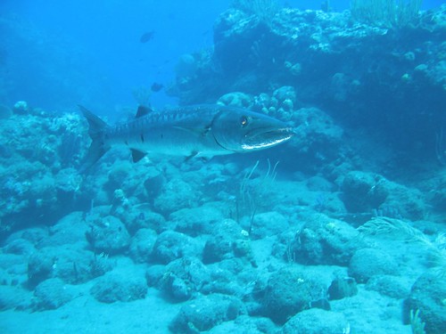 The rocks in the foreground are pretty clear (as will my real rocks in the display tank be) but the rock in the distance (left side) sort of disappears into the water. I've seen this in lots of diving pictures and it's the reason I tried to diffuse the edges of my cut outs by sponging on colors similar to the background around the edges to get that fuzzy far away underwater feel. Makes sense?
__________________
Karin Current Tank Info: 215g Caribbean Inspired Reef with Shadowbox |
|
|
|
|
07/07/2010, 11:56 AM
|
#65 |
|
Registered Member
Join Date: Oct 2004
Location: Atlanta, GA
Posts: 161
|
This is really awesome. Making me want to scrape the paint off the back of my 120G and do a similar thing!
Nice job! |
|
|
|
|
07/07/2010, 07:25 PM
|
#66 |
|
Registered Member
|
Thanks!
Could get a picture a local reef friend showed me out of my head:  Since I am stuck with the overflow boxes anyway I decided to include them more in the design I decided to add the third hump back on (behind the rock on the left) 
__________________
Karin Current Tank Info: 215g Caribbean Inspired Reef with Shadowbox |
|
|
|
|
07/07/2010, 08:28 PM
|
#67 |
|
Registered Member
Join Date: Dec 2008
Location: The beautiful State of Jefferson
Posts: 2,751
|
Brilliant idea and work! I am really impressed with this.
Something to thow into the pot... Similar to the original inspirational picture you posted, maybe have another rock pinacle in the center but a lighter shade of blue than the other two rocks. The lighter blue will give it the illusion of distance and you may get a "deeper" 3-D effect. Keep up the great work!
__________________
Broke Back Mountain is not a movie, its the pile of dead ninjas in Chuck Norris' back yard |
|
|
|
|
07/08/2010, 11:40 AM
|
#68 |
|
Registered Member
Join Date: Feb 2003
Location: Northern VA
Posts: 17,691
|
This is coming along nicely. I really love the idea and can't wait to see the finished product. So far it looks fantastic!
__________________
Adrienne The only thing to fear is fear itself....and spiders. |
|
|
|
|
07/08/2010, 12:20 PM
|
#69 | |
|
Registered Member
Join Date: Jan 2010
Location: Murfreesboro, TN
Posts: 555
|
Quote:
__________________
"The above post is my opinion only, and is in no way meant to belittle, flame, or otherwise insult anyone unless previously stated" Current Tank Info: 125 Gallon SPS Dominant T5 mixed reef and a 29 Gallon Biocube with Soft Corals, LPS, and various other polyps. |
|
|
|
|
|
07/08/2010, 12:58 PM
|
#70 |
|
Premium Member
Join Date: Oct 2007
Location: Cary, NC
Posts: 3,760
|
Very cool. I did a lightbox a couple years ago but never tried putting something inside of it to make background detail. I like your method of roughing up the acrylic to make the background hazy.
I noticed you used the same pic as me for inspiration Here's what mine looked like before the tank:  And this is taken with a long exposure time with just the lightbox on at night time. The brightness is very exxagerated but it gives a really cool effect at night:  Cant wait to see your finished project!
__________________
- Ryan B "that is enough skimmate to ruin lives." - GSMguy Current Tank Info: 220g Display, 70g sump, 35g frag, 50g fuge, 2x250w MH, 1x400w MH, 2x80w T5, 2x140w VHO Actinic |
|
|
|
|
07/08/2010, 01:09 PM
|
#71 |
|
Premium Member
Join Date: Oct 2007
Location: Cary, NC
Posts: 3,760
|
Also, I started scraping the coraline trying to form background mountains, half because I wanted to achieve what you are going for, and half because it reduces the amount of area to be scraped
Doesn't quite get the same effect as the blurryness though. This shot is 6mos old before I had some parameter flux and lost a good number of SPS
__________________
- Ryan B "that is enough skimmate to ruin lives." - GSMguy Current Tank Info: 220g Display, 70g sump, 35g frag, 50g fuge, 2x250w MH, 1x400w MH, 2x80w T5, 2x140w VHO Actinic |
|
|
|
|
07/08/2010, 05:19 PM
|
#73 |
|
Registered Member
Join Date: Jan 2008
Location: The Netherlands
Posts: 35
|
Is it not possible to use a real big photo of a big rock wirh coral behind blured acrilic.
Cut out the rock with corals and place it on a peace of foam. |
|
|
|
|
07/08/2010, 05:26 PM
|
#74 |
|
Registered Member
|
Lots of stuff is possible!
I am really looking forward to seeing what others will come up with. For my Caribbean reef the minimalistic rock is what I feel gives me the most realistic 'diving in the Caribbean' look -especially once my field of gorgonians takes center stage! I think shadowboxes could vary so much from aquarist to aquarist and system to system. I put a lot of work into this but in the end I want it to just visually 'disappear' and let the goodies in the display tank take center stage. If you wanted to put more effort into the background I bet you could get very elaborate though. Seriously people: if you are making one please post to this thread. I think there could be some really fun solutions and approaches with this.
__________________
Karin Current Tank Info: 215g Caribbean Inspired Reef with Shadowbox |
|
|
|
|
07/08/2010, 05:26 PM
|
#75 |
|
Premium Member
Join Date: Oct 2007
Location: Cary, NC
Posts: 3,760
|
Thanks euromomtx
Erikk, that's definitely a worth experimenting with. Having a nice fine haze on the acrylic would help hide the sharp silhouette. I also like Jbirds idea of tinting different pieces to simulate different depths. Using a color only slightly darker than the background would look like a very far away formation. maybe even throw some tiny dabs of distant color Bob Ross style to hint at distant colonies.
__________________
- Ryan B "that is enough skimmate to ruin lives." - GSMguy Current Tank Info: 220g Display, 70g sump, 35g frag, 50g fuge, 2x250w MH, 1x400w MH, 2x80w T5, 2x140w VHO Actinic |
|
|
|
 |
|
|
 Similar Threads
|
||||
| Thread | Thread Starter | Forum | Replies | Last Post |
| Shadowbox tank backgrounds | euromomtx | Do It Yourself |
1 | 08/09/2010 05:35 PM |
| Acrylic Background Color Recommendation | anthonydel | New to the Hobby | 4 | 04/05/2010 11:00 AM |
| Opinions on tank backgrounds...? | SLane15 | Florida Marine Aquarium Society (FMAS) - Miami/Ft. Lauderdale | 17 | 01/02/2010 05:32 AM |
| GPS as background? | Kingumar | Reef Discussion | 12 | 01/01/2010 02:03 PM |
| Background or No Background | thatguy | Saltwater Enthusiasts Association of St. Louis (SEASL) | 3 | 09/09/2006 10:09 PM |


